Library visual identity
The problem
With the new name “Alūksnes novada bibliotēka” and the upcoming move to a new location, the library needed a fresh visual identity. At the same time, the role of libraries has changed – they have become multifunctional cultural and information centers, active also in the digital space. Therefore, the new identity had to adapt to different communication channels and materials. The visual identity was created as part of my graduation project.
Visual identity elements
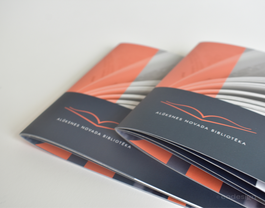
Logo
The new logo is based on the current Alūksne City Library logo – an open book, familiar to the local community and symbolically important, representing knowledge and imagination. This visual link ensures continuity and connects the new identity with the library’s history.
The logo was designed in several versions – with two color variations for different backgrounds, and a secondary version with the abbreviated name for use in smaller sizes.
The logo was designed in several versions – with two color variations for different backgrounds, and a secondary version with the abbreviated name for use in smaller sizes.
Fonts
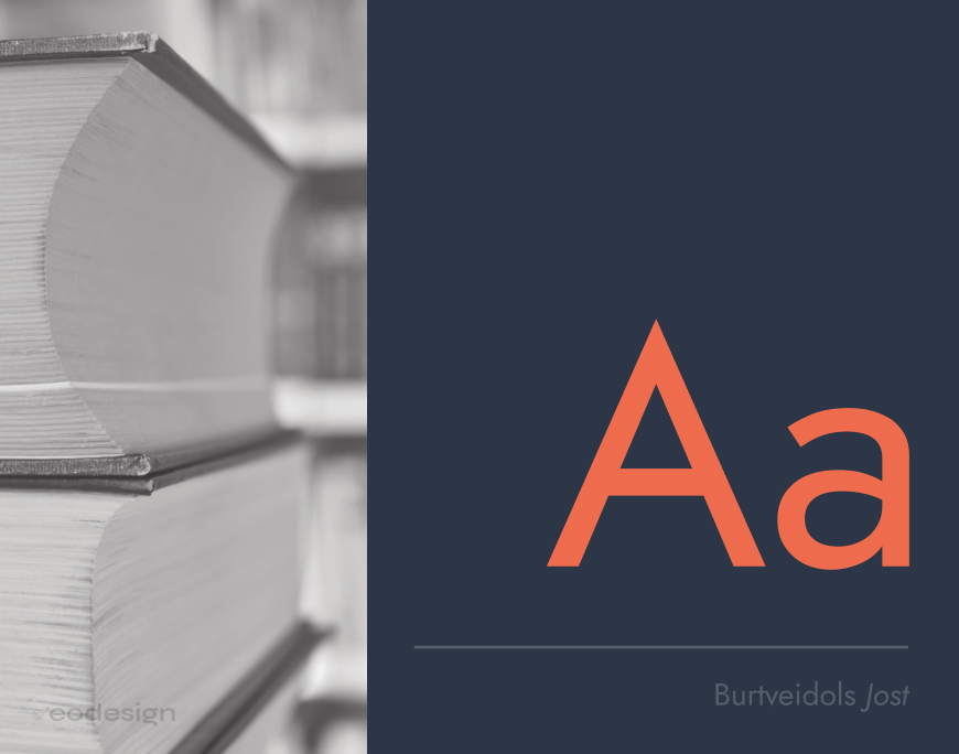
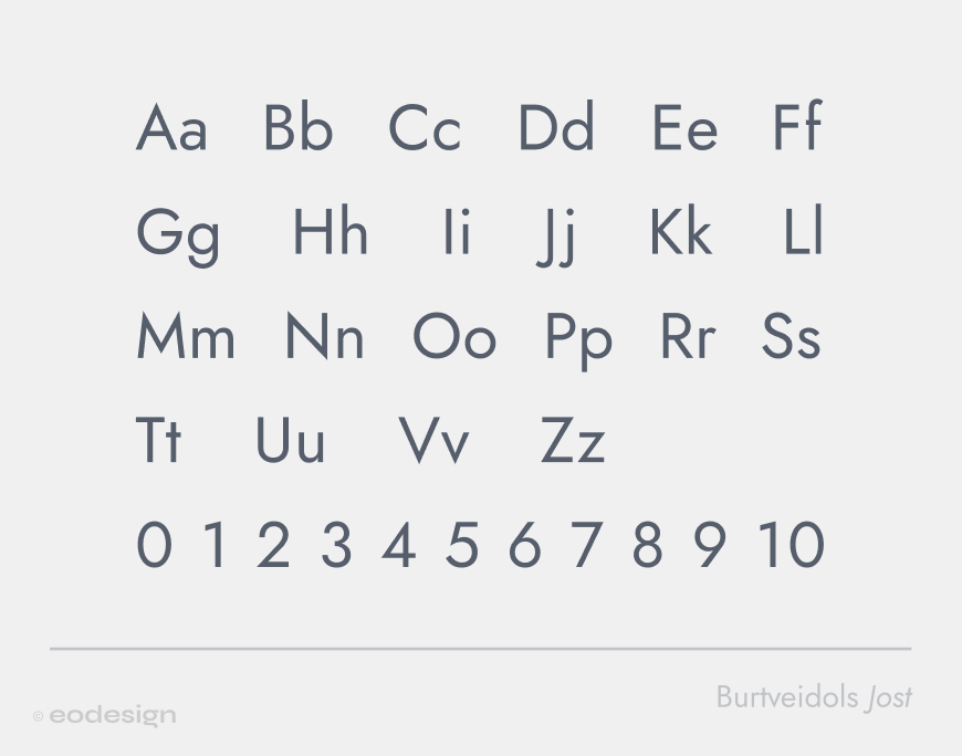
The library’s visual identity uses the typeface Jost – geometric and elegant, with a slight retro feel that fits both the library’s image and Alūksne’s visual identity. The main text uses the Regular style, while headings use Medium in uppercase.
The typeface of Alūksne District Library’s visual identity is Jost. The main text uses the Regular style, while headings are written in uppercase with the Medium style.
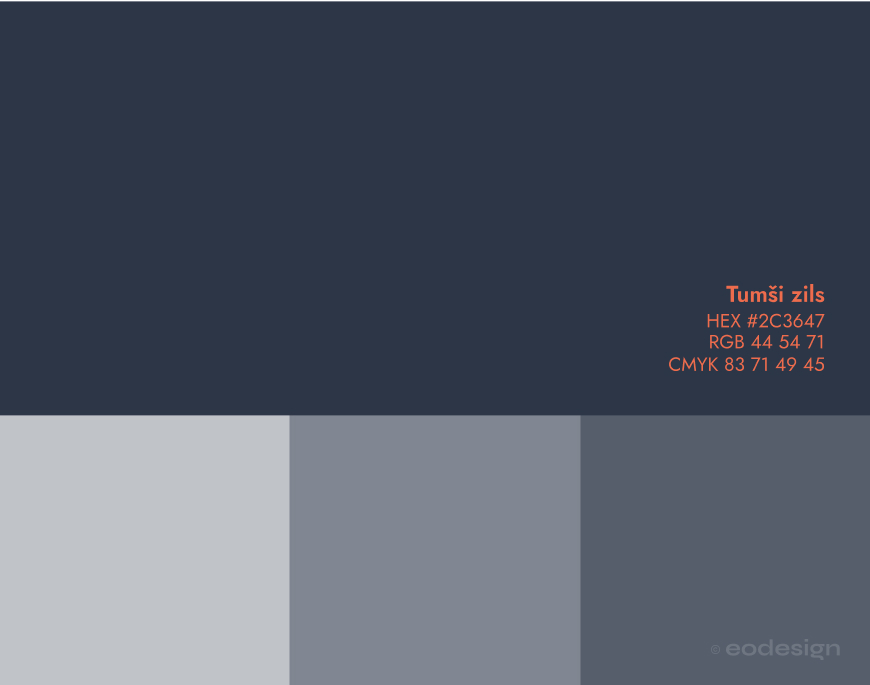
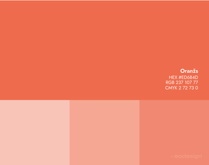
Colour palette
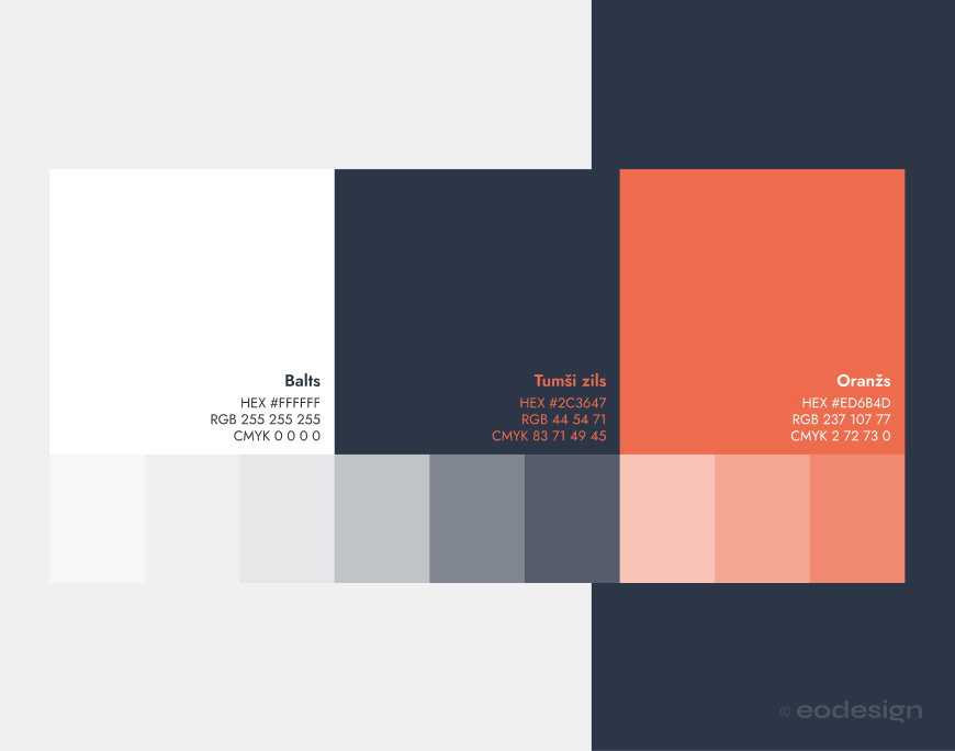
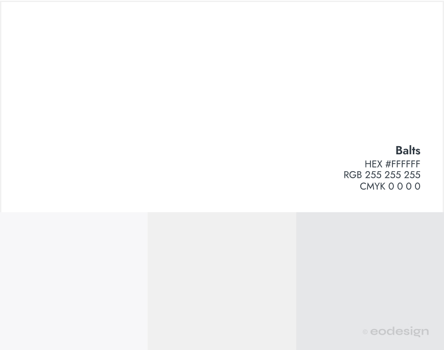
The library’s visual identity colour palette consists of dark blue, white, and orange. Blue and white serve as the base colours, creating a stable and professional look, while orange is used for accents – in headings and graphic elements – adding vibrancy and energy.
Dark blue and white serve as the base colours, creating a stable and professional image, while orange is used for accents – in headings and graphic elements – adding vibrancy and energy.
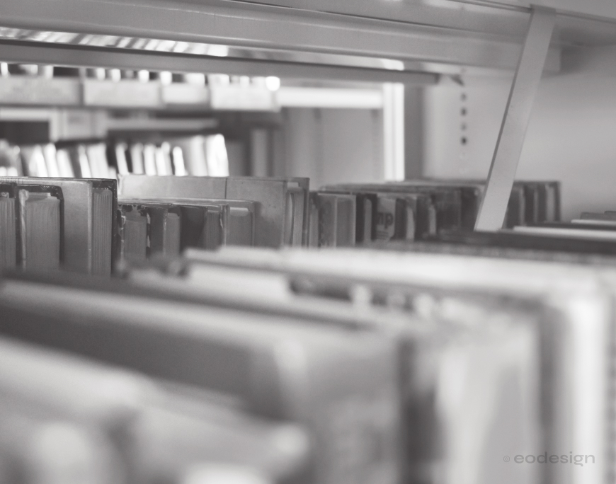
Mood photos
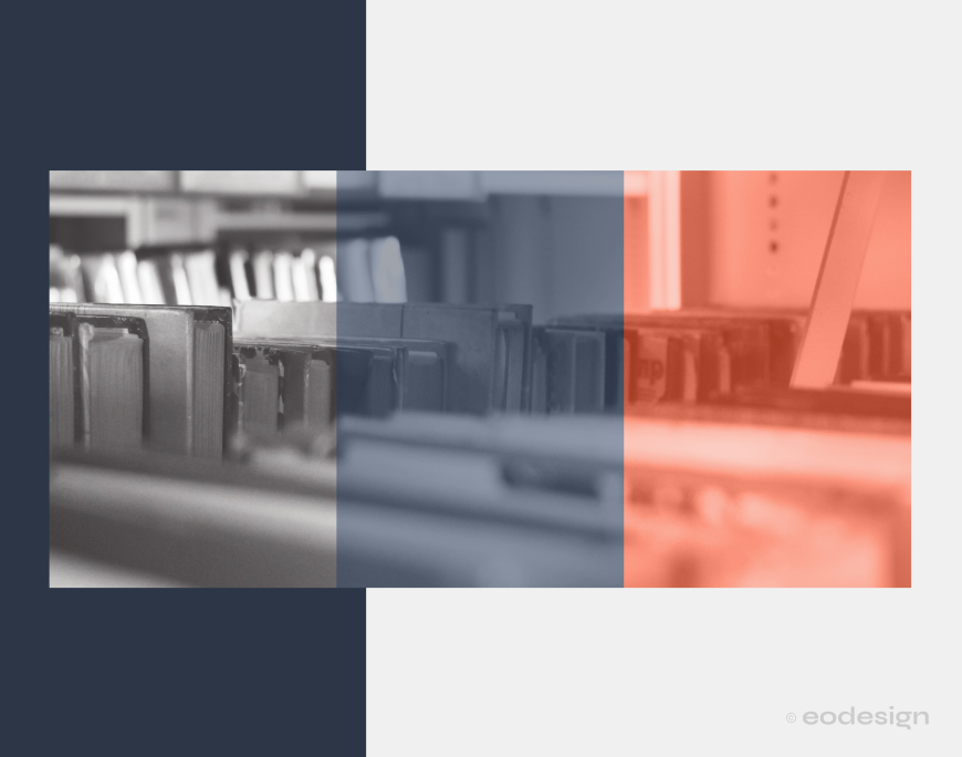
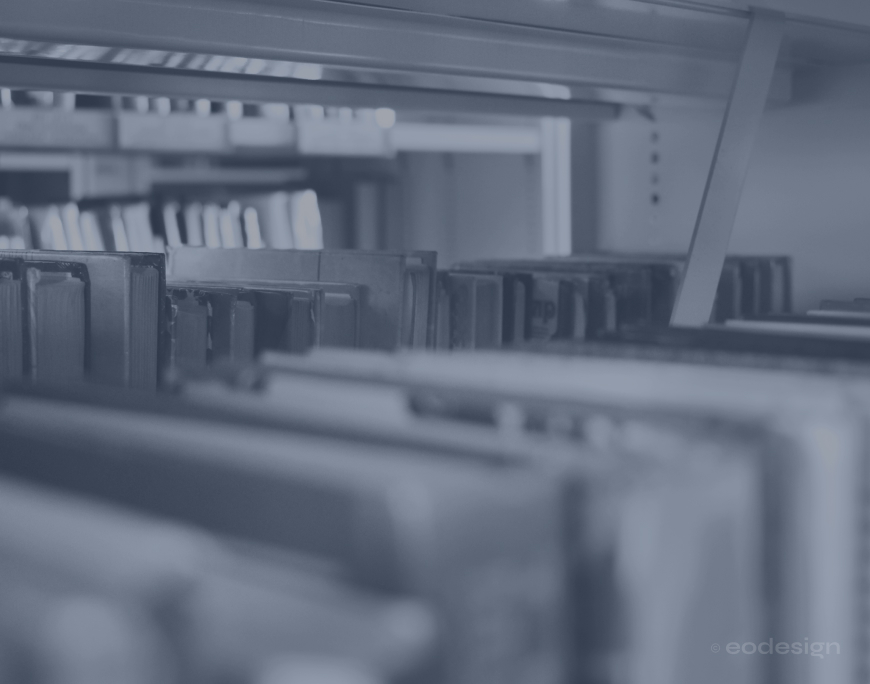
Photographs used for artistic or decorative purposes have their colour scheme adjusted to match the library’s visual identity. This post-processing is not required for documentary photos, such as event coverage.
Photographs used for artistic or decorative purposes have their colour scheme adjusted to the library’s visual identity colours.

Communication materials
Administrative and communication materials
Following the library’s visual identity guidelines, the following materials were created:
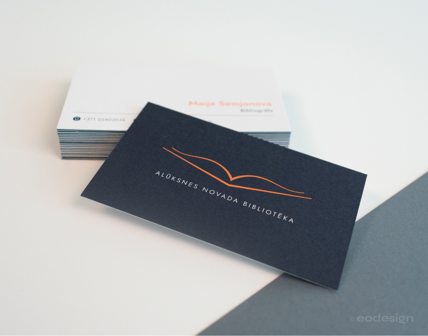
Employee business cards; One side shows the library logo, the other – the employee’s name, position, and contact details (phone, email). Size: 92 × 52 mm.
User cards; Front – logo, user’s name, ID number, and barcode. Back – library opening hours and contact details (phone, email, Facebook account). The cards are laminated, size: 92 × 52 mm.
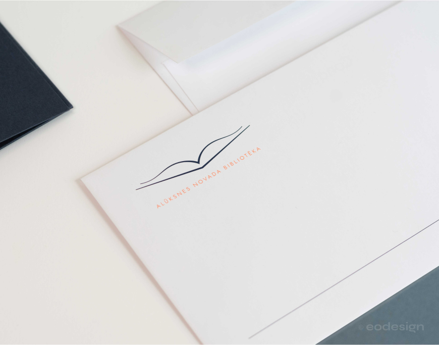
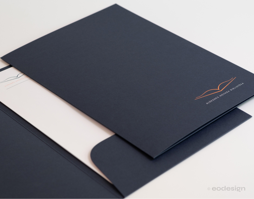
Forms and folders; Forms have the logo and a fine dark blue line at the top. The logo also appears on folders. Folder size: 220 × 360 mm.
Envelopes; Conqueror CX22 envelopes (110 × 220 mm) are used. Top left – logo, bottom – dark blue line.
As part of Alūksne District Library’s visual identity, designs were created for employee business cards, user service cards, document folders and forms, and envelopes.
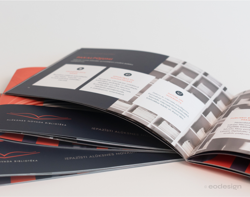
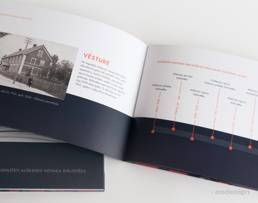
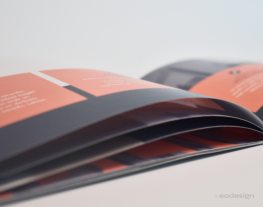
Informational publication
The publication compiles information about Alūksne District Library – its history, services, events, and other topics useful for readers.
The design combines photographs with colour blocks, creating a layout that is both visually engaging and well-structured. Most photos were taken in the library premises and photographed by me.
The publication is in A5 format (148 × 210 mm), with a total of 20 pages.
As part of Alūksne District Library’s visual identity, designs were created for employee business cards, user service cards, document folders and forms, and envelopes.
Website
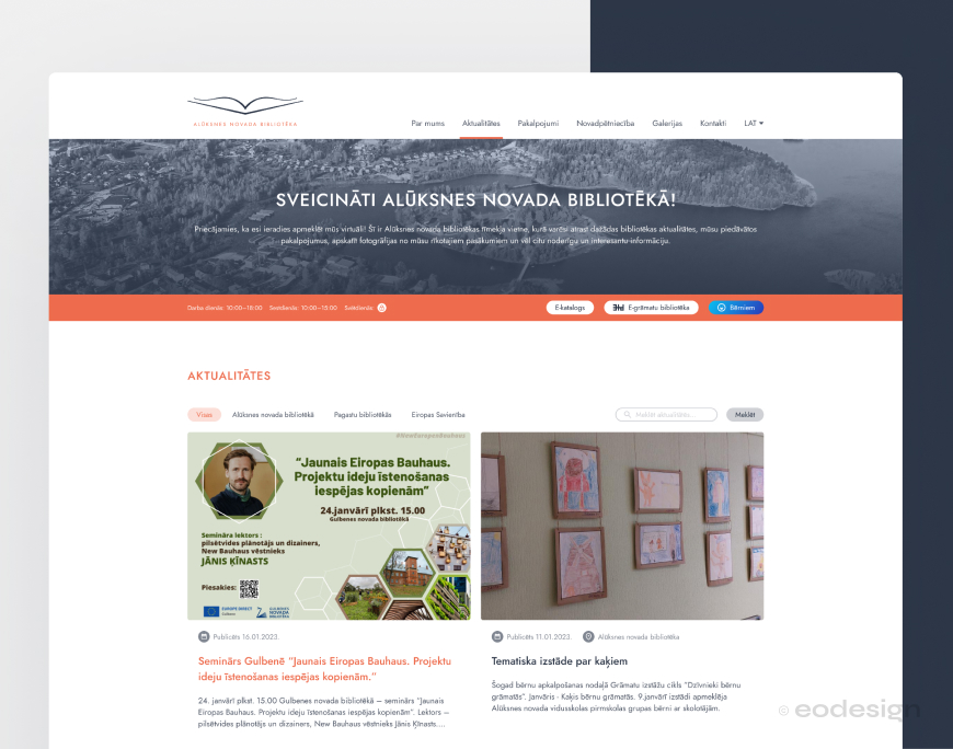
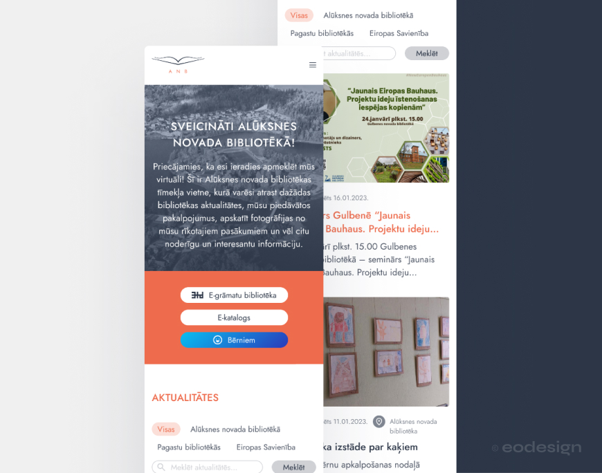
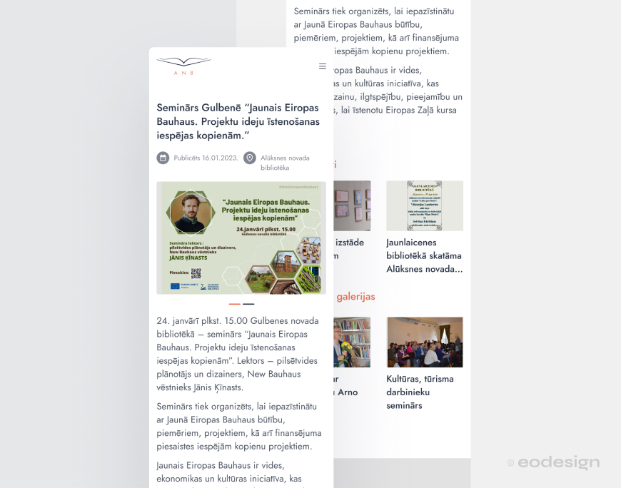
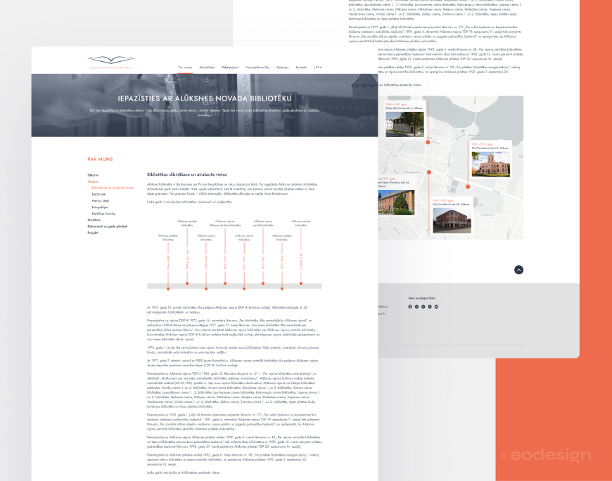
Following the visual identity guidelines, a new design was created for the Alūksne District Library website.
Along with the user interface design, the site structure was revised to improve usability. Special attention was given to clear and easy navigation, ensuring information is accessible to different user groups.
The design is responsive – adaptable to various screen sizes, providing a consistent experience on both desktop and mobile devices.
In addition to the user interface design, the site structure was revised to improve usability. Special attention was given to clear and convenient navigation, making information easily accessible to different user groups.